Column chart
Data that’s arranged in columns or rows on a
worksheet can be plotted in a column chart. A column chart typically displays
categories along the horizontal (category) axis and values along the vertical
(value) axis, as shown in this chart:

Types of column charts
· Clustered
column and 3-D clustered column
A clustered column chart shows values in 2-D
columns. A 3-D clustered column chart shows columns in 3-D format, but it
doesn’t use a third value axis (depth axis). Use this chart when you have
categories that represent:
Ranges of values (for example, item counts).
o Specific scale arrangements (for example, a
Likert scale with entries like Strongly agree, Agree, Neutral, Disagree,
Strongly disagree).
o Names that are not in any specific order (for
example, item names, geographic names, or the names of people).
·
Stacked
column and 3-D stacked column A stacked column chart shows values in
2-D stacked columns. A 3-D stacked column chart shows the stacked columns in
3-D format, but it doesn’t use a depth axis. Use this chart when you have
multiple data series and you want to emphasize the total.

100%
stacked column and 3-D 100% stacked column A 100% stacked column chart shows values
in 2-D columns that are stacked to represent 100%. A 3-D 100% stacked column
chart shows the columns in 3-D format, but it doesn’t use a depth axis. Use
this chart when you have two or more data series and you want to emphasize the
contributions to the whole, especially if the total is the same for each
category.

3-D
column 3-D
column charts use three axes that you can change (a horizontal axis, a vertical
axis, and a depth axis), and they compare data points along the horizontal and
the depth axes. Use this chart when you want to compare data across both categories
and data series.

Line chart
Data that's arranged in columns or rows on a worksheet can be
plotted in a line chart. In a line chart, category data is distributed evenly
along the horizontal axis, and all value data is distributed evenly along the
vertical axis. Line charts can show continuous data over time on an evenly
scaled axis, so they're ideal for showing trends in data at equal intervals,
like months, quarters, or fiscal years.
Types of line charts
·
Line and line with markers Shown
with or without markers to indicate individual data values, line charts can
show trends over time or evenly spaced categories, especially when you have
many data points and the order in which they are presented is important. If
there are many categories or the values are approximate, use a line chart
without markers.


Stacked line and stacked line with
markers Shown with or without markers to
indicate individual data values, stacked line charts can show the trend of the
contribution of each value over time or evenly spaced categories.


·
100% stacked line and 100% stacked line
with markers Shown with or without markers to
indicate individual data values, 100% stacked line charts can show the trend of
the percentage each value contributes over time or evenly spaced categories. If
there are many categories or the values are approximate, use a 100% stacked
line chart without markers.

·
3-D line 3-D
line charts show each row or column of data as a 3-D ribbon. A 3-D line chart
has horizontal, vertical, and depth axes that you can change.

Pie chart
arranged in one column or row on a worksheet
can be plotted in a pie chart. Pie charts show the size of items in one data
series, proportional to the sum of the items. The data points in a pie chart
are shown as a percentage of the whole pie.
Consider using a pie chart when:
·
You have only one data
series.
·
None of the values in
your data are negative.
·
Almost none of the
values in your data are zero values.
·
You have no more than
seven categories, all of which represent parts of the whole pie.
Types of pie charts
·
Pie
and 3-D pie Pie
charts show the contribution of each value to a total in a 2-D or 3-D format.
You can pull out slices of a pie chart manually to emphasize the slices.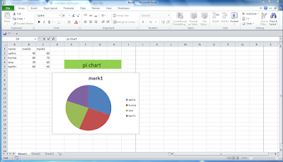


·
Pie
of pie and bar of pie Pie
of pie or bar of pie charts show pie charts with smaller values pulled out into
a secondary pie or stacked bar chart, which makes them easier to distinguish.
Doughnut chart
Data that's arranged in columns or rows only on a worksheet can
be plotted in a doughnut chart. Like a pie chart, a doughnut chart shows the
relationship of parts to a whole, but it can contain more than one data series.
Types of doughnut charts
·
Doughnut Doughnut
charts show data in rings, where each ring represents a data series. If
percentages are shown in data labels, each ring will total 100%.

Area chart
Data that's arranged in columns or rows on a worksheet can be
plotted in an area chart. Area charts can be used to plot change over time and
draw attention to the total value across a trend. By showing the sum of the
plotted values, an area chart also shows the relationship of parts to a whole.
Types of area charts
·
Area and 3-D area Shown
in 2-D or in 3-D format, area charts show the trend of values over time or
other category data. 3-D area charts use three axes (horizontal, vertical, and
depth) that you can change. As a rule, consider using a line chart instead of a non-stacked area chart, because data from one
series can be hidden behind data from another series.

·
Stacked area and 3-D stacked area Stacked
area charts show the trend of the contribution of each value over time or other
category data in 2-D format. A 3-D stacked area chart does the same, but it
shows areas in 3-D format without using a depth axis.


·
100% stacked area and 3-D 100% stacked
area 100% stacked area charts show the trend
of the percentage that each value contributes over time or other category data.
A 3-D 100% stacked area chart does the same, but it shows areas in 3-D format
without using a depth axis.


Much
like a scatter chart, a bubble chart adds a third column to specify the size of
the bubbles it shows to represent the data points in the data series.
Type of bubble charts
·
Bubble or bubble with 3-D effect Both
of these bubble charts compare sets of three values instead of two, showing
bubbles in 2-D or 3-D format (without using a depth axis). The third value
specifies the size of the bubble marker.

Stock chart
Data that's arranged in
columns or rows in a specific order on a worksheet can be plotted in a stock
chart. As the name implies, stock charts can show fluctuations in stock prices.
However, this chart can also show fluctuations in other data, like daily rainfall
or annual temperatures. Make sure you organize your data in the right order to
create a stock chart.
For example, to create a simple high-low-close stock chart,
arrange your data with High, Low, and Close entered as column headings, in that
order.
Types of stock charts
·
High-low-close This
stock chart uses three series of values in the following order: high, low, and
then close.
·
Open-high-low-close This
stock chart uses four series of values in the following order: open, high, low,
and then close.
·
Volume-high-low-close This
stock chart uses four series of values in the following order: volume, high,
low, and then close. It measures volume by using two value axes: one for the
columns that measure volume, and the other for the stock prices.
·
Volume-open-high-low-close This
stock chart uses five series of values in the following order: volume, open,
high, low, and then close.
Surface chart
Data that's arranged in columns or rows on a worksheet can be
plotted in a surface chart. This chart is useful when you want to find optimum
combinations between two sets of data. As in a topographic map, colors and
patterns indicate areas that are in the same range of values. You can create a
surface chart when both categories and data series are numeric values.
Types of surface charts
·
3-D surface This
chart shows a 3-D view of the data, which can be imagined as a rubber sheet
stretched over a 3-D column chart. It is typically used to show relationships
between large amounts of data that may otherwise be difficult to see. Color
bands in a surface chart do not represent the data series; they indicate the
difference between the values.
·
Wireframe 3-D surface Shown
without color on the surface, a 3-D surface chart is called a wireframe 3-D surface
chart. This chart shows only the lines. A wireframe 3-D surface chart isn’t
easy to read, but it can plot large data sets much faster than a 3-D surface
chart.
·
Contour Contour
charts are surface charts viewed from above, similar to 2-D topographic maps.
In a contour chart, color bands represent specific ranges of values. The lines
in a contour chart connect interpolated points of equal value.
·
Wireframe contour Wireframe
contour charts are also surface charts viewed from above. Without color bands
on the surface, a wireframe chart shows only the lines. Wireframe contour
charts aren’t easy to read. You may want to use a 3-D surface chart instead.
Radar chart
Data that's arranged in columns or rows on a worksheet can be
plotted in a radar chart. Radar charts compare the aggregate values of several
data series.
Type of radar charts
·
Radar and radar with markers With
or without markers for individual data points, radar charts show changes in
values relative to a center point.

·
Filled radar In
a filled radar chart, the area covered by a data series is filled with a color.


No comments:
Post a Comment